Victoria is facing another major outbreak after an explosion of coronavirus cases saw the return of stay-at-home restrictions for Melbourne. In the last week, hundreds of new cases have been confirmed. Yet for those near the epicentre, or those wanting to track transmission rates or understand which suburbs are most at-risk, it can be difficult to make sense of all the data. Luckily, there are some resources to help you out.
Active cases in the region have skyrocketed to 932 in recent weeks, bringing the state’s total to just over 3,000 confirmed cases since the first one was detected in January.
With daily reports adding to that total, however, it can be tough to get a true grasp of the statistics, and it can be frustrating to feel ‘lost in the numbers’ if you’re living in the affected region.
The first place you can check for updates, outside of media reports, is the official source. That would be the state’s Department of Health and Human Services (DHHS), which offers daily updates on its site. As many of us would have realised in the past few months, government sites don’t always update figures immediately and they’re not leaders in providing visual data.
Track Victoria’s cases with these visually-friendly sites
Luckily, there are folks out there dedicated to presenting data in more visually informative ways. A set of numbers might tell you the facts but it doesn’t provide the context like a visual or interactive graph or map would.
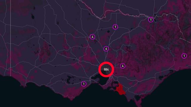
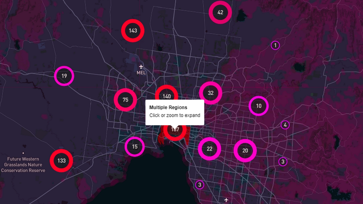
A new resource, called CovidVictoria, designed by commerce student Hassan Andrabi, takes the DHHS figures and presents them in an interactive map. You can switch between active and total confirmed cases and look at the regions most affected by the latest outbreak. It helps viewers understand the scale of the latest increase and where it’s most concentrated in the state.
If you want to also understand daily rises in cases and how Victoria is tracking against the rest of the country, the volunteer-run site Coronavirus (COVID-19) in Australia has continued to provide excellent breakdowns.
While it focused on the country-wide outbreak initially, it’s turned to providing data breakdowns of the state’s spread with a focus on tracking clusters and transmission sources.
It’s always a good idea to cross-check the data across the official sources but these volunteer-run resources often give you the information you need to understand context immediately. That’s all many of us want right now.
Leave a Reply
You must be logged in to post a comment.