fonts
-
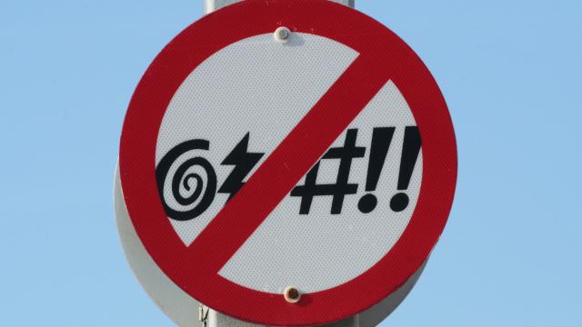
This Font Blurs Profanity and Prompts You to Use More Inclusive Language

If you’re someone who enjoys a good expletive, you may have found yourself in the position of unintentionally including one in an email — or at the very least, have wanted to. Depending on where and with whom you work, that may be frowned upon, or even automatically trigger an email surveillance system, if your…
-
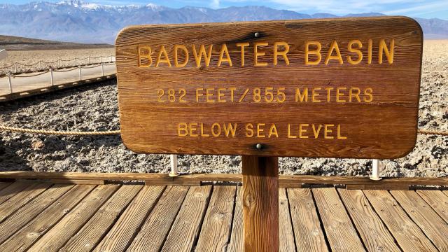
Download The US National Parks’ Typeface For Free

If you love fonts or US National Parks (or both), you’re in luck — you can download the typeface found on park signs for free.


-
Remember What You’ve Read With This Font
We’re all used to skimming past the boring parts of a reading assignment or a web article. But when researchers from RMIT University printed information in a weird, hard-to-read font, they found that people were more likely to remember what they read.

-
Calbri #Fontgate To Topple Pakistani Government?

When the Panama Papers were leaked a couple of years ago, they revealed a a bunch of information about how many public figures shuffle their money around to obfuscate their wealth – and potential ill-gotten gains. The Prime Minister of Pakistan was implicated, resulting in an investigation. And now, documents tendered by his daughter are…