
When it comes to getting the news, everyone has their preferred sources and outlets. Some people want news that reflects their own political viewpoints, while others are more concerned with the accuracy of the reporting. But how do you know which outlets have the best reporting if the articles exploring the subject are also produced by biased media sources? It can be a vicious cycle. That’s why this chart could help.
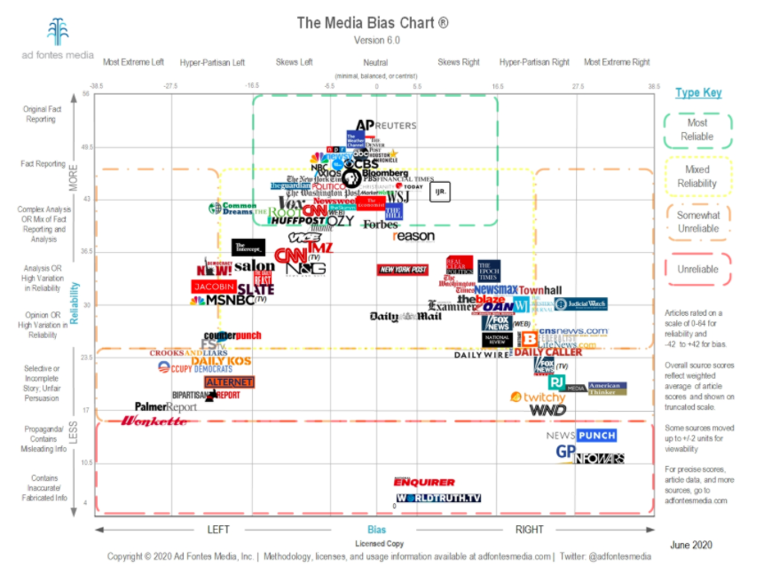
The Media Bias Chart
Back in 2016 (which was somehow only four years ago), patent attorney Vanessa Otero became alarmed at the biased information she saw people using to support their arguments on social media. So she decided to make a chart that would help plot where various outlets fall on the spectrum of political bias, as well as factual reporting. Here’s the most recent version:
“We’ve had an overabundance of proliferation of online news sources and most of it is in the area of analysis and opinion,” Otero said in an interview with Newsy. “If people understood that the sources they are consuming are actively making them angrier and polarising them, then they might choose to consume less of that.”
The chart categorises the media outlets based on two factors: facts versus editorialising, and left- versus right-leaning views. But how exactly do you read it? “It’s a two-dimensional taxonomy, so the vertical axis is quality,” Otero explained in the same Newsy interview. “So, in general, the better quality stuff is at the top, and the lowest quality stuff is at the bottom. The horizontal axis is bias, so you have your neutral or balanced stuff in the middle.” If you’d like to read more about Otero’s methodology, there’s a page on the website that walks you through the process.
Ultimately, Otero wants her chart to become like a Consumer Reports for media quality. “I want to make the news consumers smarter and the news media itself better, and those things are both really lofty, but I think it’s doable,” she told Newsy. “There are folks who, if they had this information, would make better choices as consumers of media first, and then [as] citizens.”
Leave a Reply
You must be logged in to post a comment.