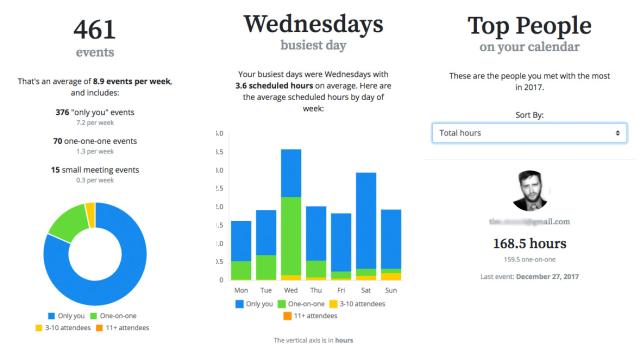
I’m a big fan of year-in-review charts and graphs, like Spotify’s 2017 Wrapped, or even designer Nicholas Feltron’s personal annual reports. Here’s another good one: Analyse your calendar with the Year in Review tool from the makers of iPhone calendar app Pod.
You’ll get graphs of your busiest weekdays and months, typical meeting size and other data. You’ll also get a detailed list of whom you spent the most scheduled time with — provided that you made a joint calendar event.
To get these graphs, you just have to give Pod access to your Google calendar, which takes a bit of trust. In their privacy policy, the company reserves the right to share anonymized, aggregate data with “business partners”, which is the kind of language Unroll.me used to justify selling Lyft receipts to Uber.
But creator Justin Krause says over email, “We don’t and won’t share calendar data with 3rd parties”. He even promises to erase the data of any user who emails him. So go get yourself some candy-coloured calendar graphs.
Year in Review [Pod]
Comments