Misusing statistics is one of the most powerful ways to lie. Normally, we teach you how to avoid misinterpreting statistics, but knowing how numbers are manipulated can help you spot when it happens. To that end, we’re going to show you how to make data say whatever the hell you want to back up any wrong idea you have.
It’s Evil Week at Lifehacker, which means we’re looking into less-than-seemly methods for getting shit done. We like to think we’re shedding light on these tactics as a way to help you do the opposite, but if you are, in fact, evil, you might find this week unironically helpful. That’s up to you.
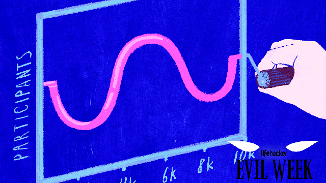
Illustration by Angelica Alzona. Photos by Wikimedia Commons, Americans United For Life and Quartz.
Gather Sample Data That Adds Bias to Your Findings
The first step to building statistics is determining what you want to analyse. Statisticians refer to this as the “population“. Then you define a subset of that data to collect that, when analysed, should be representative of the population as a whole. The larger and more accurate the sample, the more precise your conclusions can be.
Of course, there are a few big ways to screw up this type of statistical sampling, either by accident or intentionally. If the sample data you gather is bad, you’ll end up with false conclusions no matter what. There are a lot of ways you can mess up your data, but here are a few of the big ones:
- Self-Selection Bias: This type of bias occurs when the people or data you’re studying voluntarily puts itself into a group that isn’t representative of your whole population. For example, when we ask our readers questions like “What’s your favourite texting app?” we only get responses from people who choose to read Lifehacker. The results of an informal poll like this likely won’t be representative of the population at large because all our readers are smarter, funnier and more attractive than the average person.
- Convenience Sampling: This bias occurs when a study analyses whatever data it has available, instead of trying to find representative data. For example, a pay TV news network might poll its viewers about a political candidate. Without polling people who watch other networks (or don’t watch TV at all), it’s impossible to say that the results of the poll would represent reality.
- Non-Response Bias: This happens when some people in a chosen set don’t respond to a statistical survey, causing the answers to shift. For example, if a survey on sexual activity asked, “Have you ever cheated on your spouse?” some people may not want to admit to infidelity, making it look like cheating is rarer than it is.
- Open-Access Polls: These type of polls allow anyone to submit answers and, in many cases, don’t even verify that people only submit an answer once. While common, they’re fundamentally biased because they don’t attempt to control the input in any meaningful way. For example, online polls that just ask you to click your preferred option fall under this bias. While they can be fun and useful, they’re not good at objectively proving a point.
These are just some of the many, many ways that a sample can be biased. If you want to create a misleading impression, well pick your poison. For example, open-access polls on websites can be used to “prove” that whichever candidate you like best won a debate or that Undertale is the best game of all time. The beauty of sampling biases is that someone, somewhere is taking an unscientific poll that will say anything you want. So just Google around until you find an unscientific poll you like, or heck — create your own.
Choose the Analysis That Supports Your Ideas
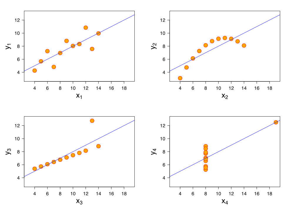
Anscombe’s quartet shows four different charts that have nearly the exact same statistical summaries.
Since statistics use numbers, it’s easy to assume that they’re hard proof of the ideas they claim to support. In reality, the maths behind statistics is complex, and analysing it improperly can yield different or even entirely contradictory conclusions. If you wanted to twist a statistic to suit your needs, fudge the maths.
To demonstrate the flaws in analysing data, statistician Francis Anscombe created Anscombe’s quartet (diagrammed above). It consists of four graphs that, when viewed on a chart, show wildly different trends. The X1 chart shows a basic scatter plot with an upwards trend. X2 shows a curved trend that was going up, but is now going downward. X3 shows a smaller trend upwards, but with one outlier on the Y axis. X4 shows data that’s perfectly flat on the X axis, save for one outlier that’s super high on both axes.
Here’s where it gets crazy. For all four of these charts, the following statements are true:
- The average x value is 9 for each dataset
- The average y value is 7.50 for each dataset
- The variance for x is 11 and the variance for y is 4.12
- The correlation between x and y is 0.816 for each dataset
If you only saw this data in text form, you might think all four situations were identical. For example, say you had a chart like X1 that showed men’s salaries at your company over the years, and one like X2 showing salaries for women over the same time at the same company. If you show only the the text, you’d see they made the same average salary! However, if you show the charts, people would see that women’s salaries were trending downward for some reason.
Anscombe suggested that to avoid misleading people, you should always visualise your data before drawing conclusions and be aware of how outliers influence the analysis. It’s hard to miss an outlier on a properly graphed chart, but they can have a massive yet invisible effect on text. Of course, if your goal is to mislead people, you can just skip this step.
Make Charts That Only Emphasise Your Pre-Conceived Conclusion
Most people don’t have the time to do their own statistical analysis, so they rely on you to show them charts that summarise your conclusions. If you create your charts properly, they should suggest ideas that correspond to reality. If you want to screw them up, you can emphasise the data you like the best.
One of the most famous, hilariously inaccurate charts in recent memory came from a member of US Congress in a meeting regarding Planned Parenthood. During this meeting, Rep. Jason Chaffetz (R-Utah) attempted to argue that PP’s abortion services rose since 2006, while its cancer services had declined over the same time period. This is the chart he used to demonstrate this:
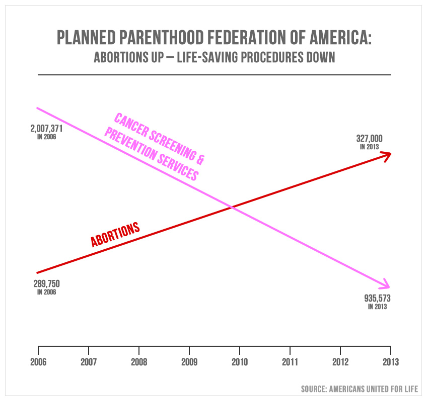
This is one of the worst chart I’ve ever seen. And it was presented to the House Oversight Committee.
At first glance, this looks like abortions have skyrocketed while cancer services have dropped dramatically. We can thank several flaws in this chart for that conclusion:
- There’s no label on the Y axis. While the lower X axis is labelled for years, the Y axis has no label at all. Is it number of procedures? Amount of money spent on procedures? Who knows! You don’t have to.
- The Y axis scales are all wrong. In addition to the incorrect label, the scale of the Y axis is all wrong. The red line’s final data point is 327,000 which is inexplicably higher on the chart than the pink line’s 935,573 final data point. Technically each line is going in the right direction, but the scaling is all kinds of wrong.
- It lacks context. These data points (such as they are) only suggest what happens, not why it happens. For example, in 2009 the US Preventative Services Task Force updated its recommendation to get mammogram screenings every two years, instead of its previous suggestion of every year. This could account for the decrease in cancer screenings.
Most charts aren’t quite this flagrantly wrong, but it’s a great example of how to mislead by simply leaving out a few key elements of a chart. News site Quartz showed what this chart would look like if it were represented properly (note 2008 data is not provided and thus missing from the chart):
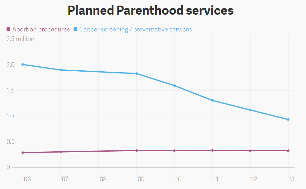
This is much more accurate. If you’re into that sort of thing.
On this scale, the rise in abortion procedures is relatively flat, while cancer screenings have gone down. However, since individual data points are shown, we can see that the decline began right around 2009, just like we predicted. This is how you accurately present information in its proper context! So if you want to mislead people, all it takes is a little chart fudging. Leave off your labels, manipulate the axis a bit and you too can trick people into thinking you have a better point than you do.
Obscure Your Sources At All Costs
The easier it is to see your sources, the easier other people can verify or disprove your conclusions. If your conclusions can be verified, then by all means let people see your data and how you got there. However, if your goal is to mislead people, never let anyone find out how you came to the conclusions you did.
For proper sourcing, every single person who ever mentions a piece of data will include a reference to the source. News sites should link to the studies or research they’re quoting (not articles about the studies). Researchers may not show their entire data set, but the source of a study should answer some basic questions:
- How was the data gathered? Did you call people on the phone? Stop them outside a shopping centre? Was it a Twitter poll? The method that you use to gather your data might point to (or disprove) sampling bias.
- When was the data collected? When did you collect the data and how long did it take to gather? Reports can get outdated fast and trends can change over time. Including the time frame that data comes from can say a lot about the conclusions you draw.
- Who collected the data? The person or group that collects data may provide hints about how trustworthy the data is. A tobacco company study claiming cigarettes are safe might not be correct unless someone else can verify it.
- Who was asked? Particularly in the area of surveys and polls, it’s important to know who was questioned. If a politician only polls people that are already friendly to them, they won’t get data that represents the population as a whole.
Sourcing isn’t just used to avoid bias, but to give others the chance to verify your claims. It opens your data, your methods and your conclusions up to criticism. It lets other try to poke holes in your ideas. If your conclusions can’t stand up to criticism, then they fall apart. The most accurate statistics are the ones that others can see and corroborate with their own research. However, if your goal is to mislead yourself or someone else, don’t bother sharing the sources. In fact, your best defence is to just say “Look it up!” and walk away. No one can disprove that.
Comments
2 responses to “How To Lie To Yourself And Others With Statistics”
Pretend that ‘statistical significance’ has any meaning in the real world.
“all our readers are smarter, funnier and more attractive than the average person.”
This is what’s known as the Bullshit Bias.
But, thanks…