
Statistics have become a fixture of modern society. We read them in news stories and they’re used to determine policies that will affect every aspect of our lives. Unfortunately, many people wildly misinterpret them. Here are four common errors to look out for.
In the past, we’ve discussed some of the fundamental details to check for when interpreting statistics and how it can be easy to misinterpret data. Here, we’re going to highlight four common errors in statistical interpretation.
The Base Rate Fallacy
Here’s how the base rate fallacy works: say you have a company with 25 per cent female employees and 75 per cent male employees. From the outside, this would appear to be a biased selection of male candidates (assuming a roughly equal distribution of genders), and you might assume the company is less inclined to hire females.
However, this ignores the pool of applicants. If only 10 per cent of applicants were females, then a higher percentage of women who applied were actually selected.
Another common example involves the mythical terrorist-spotting device. Imagine a box that has a 99 per cent success rate at positively identifying a terrorist and a 99 per cent chance at properly identifying a non-terrorist correctly. One might assume that if from population of 1 million people, 100 of whom are terrorists, the box identifies a person as a terrorist, there is a 99 per cent chance it’s correct.
In reality, it’s a lot closer to 1 per cent. The reason is that the box falsely rang for 1 per cent of non-terrorists (9,999 people), as well as correctly ringing for 99 per cent of real terrorists (99 people).
Extrapolation
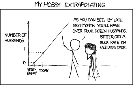
Extrapolation is a favourite tactic of anyone anticipating economic trends or predicting the future. Essentially it’s this assumption: “This thing happened over a set period of time, therefore it will continue to happen.” However, that often isn’t true. When analysing past trends, we have to keep in mind that the factors that produced those trends are subject to change.
Take, for example, smartphone market share prediction. Back in 2009, Gartner predicted that by 2012, Symbian would be the top smartphone operating system worldwide, with 39 per cent of the market, while Android would have only 14.5 per cent. Gartner also predicted that Windows Mobile would be beating Blackberry, and sitting just behind the iPhone. As is evident if you head into a phone shop these days, this wasn’t even remotely the case.
So, why was Gartner so far off the mark? Because extrapolation doesn’t account for changing circumstances. Microsoft killed off Windows Mobile in favour of Windows Phone, a platform that Nokia adopted instead of Symbian. That altered almost every aspect of the projections. Things always change, which is why nearly all predictions based on statistical trends should reasonably be followed with the phrase “…assuming nothing changes.”
Correlation That Doesn’t Always Imply Causation (But Might)
We’re often reminded that “correlation doesn’t imply causation”, and indeed the phrase was common back in Roman times, scoring its own Latin adage: cum hoc ergo proptor hoc. However, the counterpoint to this that often gets overlooked is that correlation raises questions about causation. To quote xkcd (again): “Correlation doesn’t imply causation, but it does waggle its eyebrows suggestively and gesture furtively while mouthing ‘look over there’.”
Consider one highly controversial example from the Missouri University of Science and Technology. Researchers found certain types of internet usage correlated to depression. Users suffering from depression were found to check email more often, watch more videos, and indulge in more file-sharing.
The initial assumption made by many reading was that the study claimed that internet usage led to depression. The mantra that “Correlation does not imply causation!” could be invoked to argue the study is incorrect, but it also throws the baby out with the bathwater. When there is no direct explanation for why one thing correlates to another, further study — not outright dismissal — is warranted.
The Simpson’s Paradox
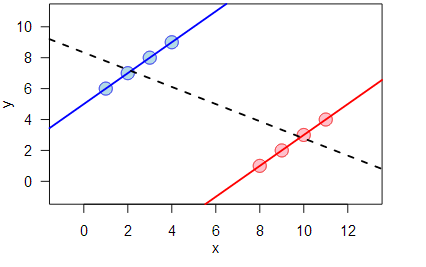
The Simpson’s paradox is a complex mathematical phenomenon, but worth trying to understand. The short version is that sometimes when you examine data in sub-groups, you can see one trend, but see a completely opposite trend when you view that same data in aggregate.
For example, the median wage, adjusted for inflation, rose in the United States since 2000. However, the median wage actually fell for every sub-group of workers.
The consequences of this paradox are that occasionally, if you’re looking at data in combined form, you will be led to the opposite conclusion you’d reach if you looked at it in parts. One famous example, based on a real study, found that a kidney stone treatment A was more successful in treating both large and small kidney stones when viewed separately, but treatment B was more successful when both groups were combined.
This makes decisions based on data subject to Simpson’s Paradox to be more complex. On the one hand, if you know the size of a kidney stone, treatment A would be obviously preferable. However, when you start dividing data up to yield different results, you can cut up the data to show anything you want.
The best course of action with Simpson’s paradox (and, in fact, with any statistical data), is to use the information to refer back to the story of the data. Statistics are heavily maths-based, but they’re used to analyse real-world scenarios and situations. Separated from reality, statistics are of limited value. Context is everything.
Comments
9 responses to “Four Common Statistical Misinterpretations You Should Avoid”
Reminds me of Scott Adam’s list of logical fallacies:
http://www.leany.com/logic/Adams.html
Good choices. I think there is a more common one you missed: not understanding what “significance” means. This is the one exploited by global warming denialists, some of whom know what it means and use it to lie with deniability. The story they tell is “no significant warming for 15 years” which they know you will interpret as “warming has stopped” when it really means “if you select an arbitrary period of time the tools we use to rule out the possibility that the rise was due to chance don’t work”.
I have to explain the correlation one frequently. I do a lot of stats in my work, and the fact is, correlation often implies causation. For example, there are many circumstances where the direction of the effect is obvious i.e. height and number of ‘dunks’ in an NBA season.
The other one I hate is “the variance within the group is greater than the variance between group members” usually in the context of IQ and EQ differences between groups (gender, race, etc.). It’s not obvious what the point there is. The same could be said for height, but we all accept that men are generally taller than women!
“correlation often implies causation” – but it doesn’t tell you the direction of the causation, and frequently a number of correlated factors are all the result of separate cause that doesn’t show up in that study.
Correlation only invites further study. Drawing conclusions from it is always fraught.
“the variance within the group is greater than the variance between group members”
That’s still a very important point! It means that the generalisations you form about groups are often incorrect and it tells you why. Obviously there are exception, as in the example you mention, but that does not invalidate it’s meaning.
“Correlation That Doesn’t Always Imply Causation”
This is the most significant one that we see today in modern science..
A small example:
Three events (A, B, and C).. A happens first, B second and C third.. those studying C might only see B because it happened after A and they are so focused on C that they are ignoring A, so they infer that C is caused by B when there is the distinct possibility that is caused by A but just takes longer to be seen than B.
Right but we have tools to control for other factors. Sometimes even though you can’t demonstrate causation directly, you control for enough factors to show whether A causes C or B causes C or A causes C transitively (by causing B which causes C).
It depends on the design of studies and interpretation of data. “Tools” are only as good as their design and use.
Mistakes interpreting data are frequently made by laypeople such as me and many others, in terms of correlation and causation, and even some experts. But I think this article is mainly aimed at the laypeople, not the experts.
Awesome article, but I do find it ironic that based on the comment history i’ve been forced to leave in my wake on this site.. some of your coworkers could benefit more from this than us heh.
The Church of the FSM has been arguing that one for years. Far more research is required to determine the link between dwindling pirate levels and increased levels of CO2.