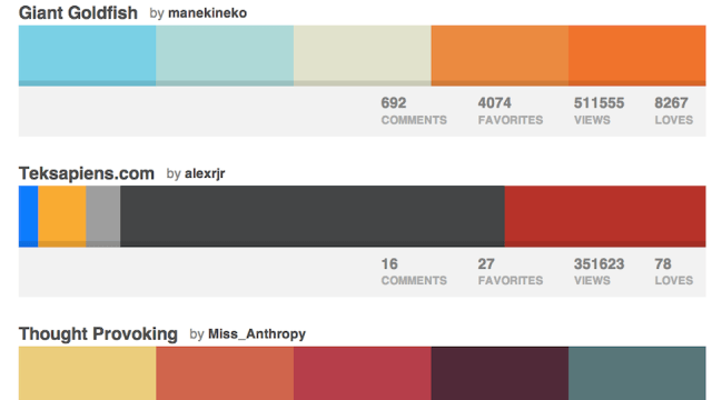
Colours are important to make your presentations look good, but not everyone has a good sense of which ones complement each other. Zach Holman suggests a cheat: go to a site like ColourLovers and look through palettes suggested by designers.
The “Most Loved” section is a good place to start, but you can try some of the other categories too. You need to bear in mind that your selection has to work well through a projector:
Usually I look for bright colours that go well on projectors. That means colours with a lot of contrast. For example, choose a dark, a light, and an accent. That way you can layer the dark on the light and still read it from in the way back of the room you’re giving the talk.
Holman also suggests breaking up different sections in different colours. There’s plenty more advice in the link below.
Color [Speaking.io]

Comments