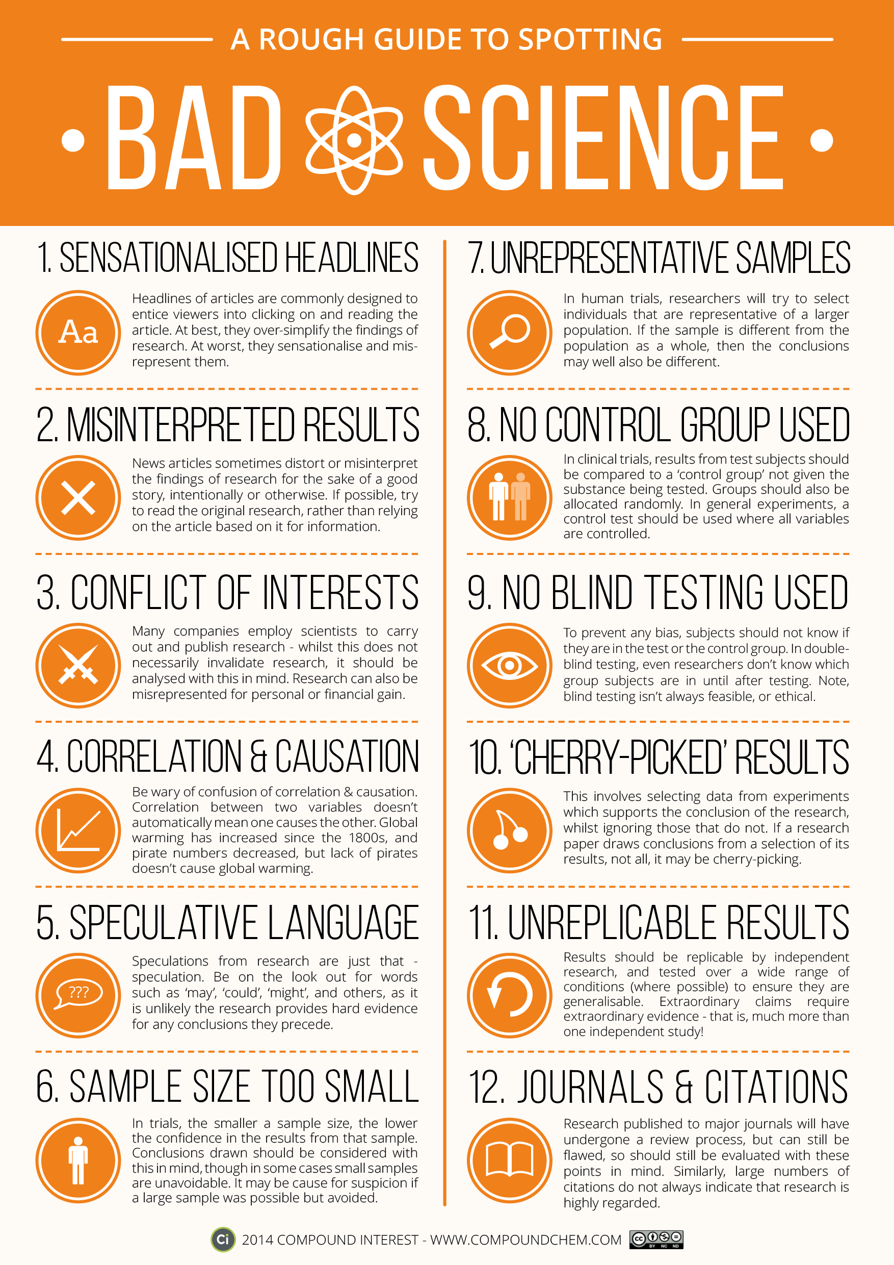
Science is amazing, but science reporting can be confusing at times and misleading at worst. The folks at Compound Interest put together this reference graphic that will help you qualify the impact of the study you’re reading.
One of the best and worst things about having a background in science is being able to see when a science story is poorly reported. One of the worst things about writing about science is worrying you’ll fall into the same trap. It’s a constant struggle, because there are interesting takeaways, even from preliminary studies and small sample sizes, but it’s important to qualify them as such so you don’t misrepresent the research. With this guide, you’ll be able to see when a study’s results are interesting food for thought that’s still developing, versus a relatively solid position that has consensus behind it.
You’ll see some common afflictions here, like studies and articles that discuss correlation but don’t point to causation (and it’s important to read studies before trotting out that aphorism too — some studies actually do account for causation, but it’s overlooked when reported), stories on preliminary studies with small sample sizes or narrow selection and so on. It’s not a perfect chart, and many of the commenters at Compound Interest rightfully call them out on certain items, but it’s a useful reference for honing your critical thinking skills when reading science news and reporting.
You can ownload a PDF version of the chart here, or hit the link to Compound Interest to read more or buy a wall print.
A Rough Guide to Spotting Bad Science [Compound Interest]
Comments
3 responses to “This Graphic Is A Rough Guide To Bad (Or Badly Reported) Science”
So, basically we shouldn’t listen to anything from Allure Media.
Yup… Sensationalised headlines or “Click Bate” is one of allures mainstays… 🙂
Wow! Every single one of those is a reflection of ‘the settled science of climate change’.
Any article about cosmology will meet all 8 points.