charts
-
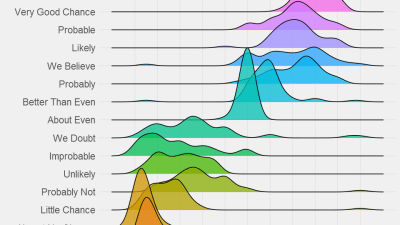
How To Read A COVID-19 Graph

When you see a flat line on a graph, it’s tempting to think, “Oh hey, at least the situation isn’t getting any worse!” But one of the common types of charts we see for COVID-19 is of new cases per day. In that case, a flat line means that things are, in fact, still getting…
![This Chart Shows The Lawn Maintenance You Need To Do Every Month Of The Year [Infographic]](https://www.lifehacker.com.au/wp-content/uploads/2015/11/08/1508809884719993156.jpg?quality=75&w=400&h=225&crop=1)
-
![The Mobile Apps That People Regret Using Most [Infographic]](https://www.lifehacker.com.au/wp-content/uploads/2018/02/09/hodgov9yvs39atetpefs-scaled.jpg?quality=75&w=640&h=360&crop=1)
The Mobile Apps That People Regret Using Most [Infographic]
People use Grindr, Two Dots and Reddit of their own free will. But they don’t really feel good about it, according to a joint survey by the mobile app Moment and the Center for Humane Technology.
![Hot Sauces, Ranked By Scoville Units [Infographic]](https://www.lifehacker.com.au/wp-content/uploads/2017/10/05/b8aspo1x1wg58rbtbvgg.jpg?quality=75&w=400&h=225&crop=1)
-
![Make Sense Of ‘Rick And Morty’ With This Character Timeline [Infographic]](https://www.lifehacker.com.au/wp-content/uploads/2017/10/05/jg8hlw4lsyoxd6grz2w7.png?quality=75&w=640&h=360&crop=1)
Make Sense Of ‘Rick And Morty’ With This Character Timeline [Infographic]
After three seasons of alternate timelines and deep-cut callbacks, the Adult Swim comedy Rick and Morty is complicated enough that you might need to consult this character timeline chart. It tracks every significant or named character from the series so far, marking their appearances and deaths.
![How To Treat Hypothermia Properly [Infographic]](https://www.lifehacker.com.au/wp-content/uploads/2016/12/17/ahzx0bh8yirarjhpykdo.jpg?quality=75&w=400&h=225&crop=1)
-
It’s Official: New Zealand Is Better Than Australia
The latest World Happiness Report has just been released by the United Nations. The top ten was dominated by Northern Europe, with Norway taking out the top spot. The only countries in the Southern Hemisphere to make the cut were New Zealand and Australia – with the former beating the latter. That’s right: Kiwis are…