charts
-
![The Basics Of Soldering Explained [Infographic]](https://www.lifehacker.com.au/wp-content/uploads/2016/12/31/gpmezrhdjd8cnbdrbck8.png?quality=75&w=640&h=360&crop=1)
The Basics Of Soldering Explained [Infographic]

Soldering electronics is a delicate art. If you’re just getting started learning how to solder, this handy reference chart can help you spot some common mistakes and make sure your work comes out right.

-
![This Pokemon Go Chart Reveals Which Pokemon Types Are Strong Or Weak Against Yours [Infographic]](https://www.lifehacker.com.au/wp-content/uploads/2016/08/17/zxuhwf8c9rbf78inkznh.png?quality=75&w=640&h=360&crop=1)
This Pokemon Go Chart Reveals Which Pokemon Types Are Strong Or Weak Against Yours [Infographic]
If you want to be the greatest Pokemon trainer there ever was, you should know the strengths and weaknesses of not only your own Pokemon, but also of other Pokemon that you want to fight or tame. This cheatsheet from Pokemon Go Database lets you quickly reference how your own Pokemon measure up against others.
![How To Craft Your First Story [Infographic]](https://www.lifehacker.com.au/wp-content/uploads/2016/07/11/oy8alecamxfsp8e5htiu.png?quality=75&w=400&h=225&crop=1)
-
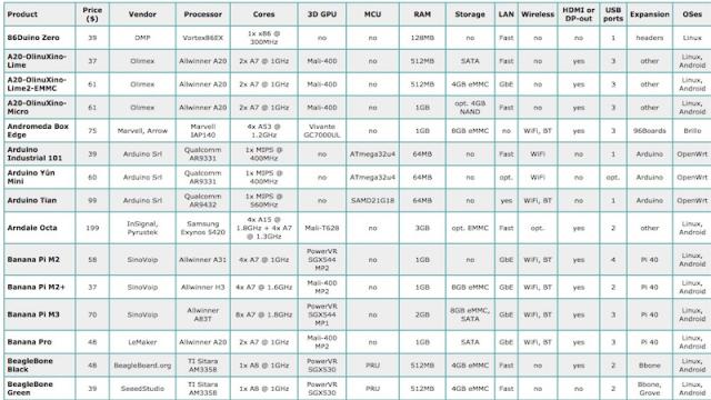
This Chart Compares 81 Hacker Friendly Single Board Computers
2You have a ton of different options for single board computers that can run the likes of Linux or Android. While a board like the Raspberry Pi might be the most popular, it’s certainly not the only one. Over on HackerBoards, they have a massive chart comparing all 81 different boards.
-
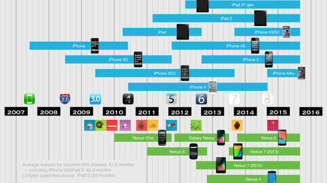
This Chart Shows How Long iOS And Nexus Devices Get Updates
When you buy a new phone, you might reasonably want to know how long it’s going to get software updates. This chart helps you get an idea of what each platform is like by examining iOS vs. Nexus support lifetimes.