You can now trick out the look of your iPhone’s various pages and customise your app icons much more than Apple has ever allowed you to do before. That’s all thanks to iOS 14 and Apple’s Shortcuts app.
Here’s how it works: You move your apps off your pages to your App Library, and you create shortcuts to launch each individual app instead. In other words, launch Shortcuts and tap on + > Add Action > Scripting > Open App, and then tap on “Choose” to pick the app you want to use the shortcut to open.
Once you’ve tapped forward to name the shortcut (ideally, the name of the app you’re looking to launch), you can tap the shortcut’s triple-dot icon, tap the triple-dot icon that appears again, and then tap on “Add to Home Screen.” You then tap on the icon under “Home screen name and icon” to change it to photo or file on your device.
It’s time-consuming, sure, but it’s a simple enough task. The hardest part of the process is coming up with a cool design. To help out, I’ve rounded up a number of the most outrageous, interesting, and artsy iPhone customisations I’ve seen this weekend. If you have one you’re especially proud of, drop me an image link in the comments. Be sure to crop out any identifying information if you’re worried about that sort of thing.
(Also, how long Apple will allow this is anyone’s guess. I’ve seen enough porn-themed versions of these “custom” app icons to give any Apple executive a heart attack.)
Just slightly worse than iOS 14’s defaults
iOS 14 let’s you re-do app icons so naturally remade them all much worse in MS paint style
Sorry to all app icon designers that spent years making them nice pic.twitter.com/bsa0E5VvSy
— Thomas Reisenegger.gif (@Olima) September 20, 2020
This design from @Olima is a great first step if you’re nervous about what theme you should make for your own iPhone. Just take what already exists and make it slightly worse better, all in the name of experimentation and fun.
Stay on brand
I spent like 5 hours on my iOS 14 layout and made every single app icon myself and I still think it looks ugly❤️ pic.twitter.com/HGFAv5VOg6
— Emma (@kuromiluvsmelo) September 20, 2020
It’ll take some Photoshop magic, but why not drop yourself — or the avatar representing yourself — into all of your icons? I love this take from @cactus_arms, which feels like something a Twitch/YouTube/wherever streamer would do. Maybe that’s just me. Had I the patience, I’d do it too!
Get cutesy
So I’ve been playing around with the new iOS 14 update and I found out you can customize the app icons and uh pic.twitter.com/wj5f80KtSi
— ????Flapo???? (@MrYeetManSmells) September 21, 2020
Again, I appreciate a good theming, and @MrYeetManSmells nails this one. My advice is to avoid just doing a hodgepodge of random icons for your new shortcuts. Try to keep them aligned around a subject, a colour, whatever — anything that helps them feel like they’re part of a larger, cohesive collection can help your iPhone look a lot less cluttered.
Go truly old-school
why did i do this pic.twitter.com/4boDQvsNVm
— ash ☆彡 (@ARTSHL3Y) September 18, 2020
It doesn’t get much better than this. This is exactly the kind of look you want to casually drop off at your next job interview for a tech company, so they can fully appreciate the full range of your geek cred. Amazing work, @ARTSHL3Y.
Do it for Baby Yoda
I present to you, the first Star Wars aesthetic iOS 14 Lock Screen (that I am aware of) pic.twitter.com/dJxvmzkkMV
— Leah ✨ (@leah_elizabethj) September 20, 2020
I’m not confident that @leah_elizabethj has the first custom iOS 14 look themed around Star Wars, but it’s certainly a good one. And, yes, she’s using the helpful Widgetsmith app to drop customised widgets into her theme, which is yet another tool you can use to trick out your iPhone’s look. What has Apple unleashed?
Don’t tell Tom Nook that you’re stealing his phone
I’ve got my own Nookphone now! Customised my home screen with ACNH themed icons, thanks iOS 14!
#animalcrossing #acnh pic.twitter.com/jOwWVIbFzj— gen ̖́ – @ ginkgo island ★彡 (@okpng) September 18, 2020
Were I a rabid Animal Crossing: New Horizons player, which I am, I would absolutely buy this amazing icon pack from @okpng. It’s cute, it’s subtle, and it helps you finally transform your boring ol’ iPhone into the critical island device that your little virtual avatar uses to maintain peace and joy on your little permanent getaway. It’s perfect, just like a gorgeous five-star island.
Go really, really old-school with your gaming
made mine look like a ps2 memory card screen✍️ #ios14homescreen pic.twitter.com/ZYiZ9LQtTW
— jenni (@wholelottajenni) September 21, 2020
I never owned a PlayStation 2 — I was more a Nintendo guy — but I can imagine this home screen brings back nostalgia for those of you who loved playing games like Twisted Metal, Tony Hawk, Final Fantasy X, and the lot. That’s about all I can remember from that era, since those were basically the games I watched my friends play at their houses. Thanks for reminding me of my silly Nintendo 64 ways, @wholelottajenni.
Hand-drawn icons? Yes
Here’s my new edition. I am officially an insomniac.
#ios14homescreen pic.twitter.com/iPL1J6raxq
— ????️???? (@TomHarveey) September 21, 2020
I love this approach from @TomHarveey, who has actually found a way to improve the look and feel of his app’s icons instead of going completely wild with them. I’d absolutely use these, no question; they look that good.
Hop into your little iOS time machine
Used the ios 6 icons for my homescreen #ios14homescreen pic.twitter.com/6Q6MpCMrUn
— Alvarez???? (@alvarezbenjaro) September 19, 2020
iOS 14? Pffft. Who needs it (except to hack together customised “app icons”) when you can have the glory that is iOS 6 fully represented on your state-of-the-art mobile device. For those curious, iOS 6 debuted right around the time of the iPhone 5. Yes, fellow geeks, we are all that old, and we have @alvarezbenjaro to thank for this little nostalgic kick.
Go monochrome to the extreme
— ArunTerry (@arunterry) September 21, 2020
First, you should absolutely go follow Matthew Cassinelli on Twitter, so you can bask in his video of gorgeous iOS 14 home screens if (or when) he creates it. After that, you should consider going completely black-and-white with your iOS 14 device. It’s a bold, refreshing look that will absolutely make your iPhone stand out in a crowd; were it only able to save you battery life, too, but that’s not how this works unfortunately. If you love dark mode, though, @arunterry’s look is the one to go for.
Make a “see-through” set of icons
I saw this one on Reddit (thanks gmunoz14), and it’s absolutely wild. I really don’t want to think about how much time this took to do, but the end result is absolutely worth it. Had I only even more patience than all the previous customised icons to create something as creative as this.
For your kid-at-heart kind of life (or your actual kid)
If everyone’s showing their new #iOS14 #ios14homescreen then here’s mine pic.twitter.com/eIyrqI4KHH
— cat that doesnt like bread (@JohnDav52533934) September 21, 2020
This Minecraft-style home screen from @JohnDav52533934 looks neat and all, but you do realise this means someone is now going to go into Minecraft and make a working iPhone that’s themed like a Minecraft-style iPhone. That’s just how these things tend to play out.
Who lives in a…
not me updating my phone for the first time in months just so i can make a spongebob themed home screen #ios14homescreen pic.twitter.com/UqeEW5puls
— dawn ♡ (@luigikartds) September 21, 2020
I don’t really need to sing the rest, do I? Just silently hum it to yourself while you enjoy the Nickelodeon-like design of @luigikartds’ humble iOS 14 device. I’m slightly bummed there wasn’t a hamburger-looking icon to represent a certain patty-selling store, but perhaps that’ll arrive in v2 of this look.
HI, I’M DAISY
Alright now i think i made it look better #ios14homescreen pic.twitter.com/t8NrbrGu1p
— ????「マグロ」???? ⁱ ᵃᵐ ⁱⁿ ˡᵒᵛᵉ ʷⁱᵗʰ ᴾʳⁱⁿᶜᵉˢˢ ᴰᵃⁱˢʸ (@tunasub187) September 21, 2020
‘nuff said, @tunasub187. Now make a Toadette.
You can sit with us this time
did a lot of effort doing my homescreen than doing my homework ????????♀️ #ios14homescreen pic.twitter.com/gUE418ESym
— jem (@lzldjem) September 21, 2020
I’ll spare you the obvious “when do we wear pink” joke, but know that I’m thinking it very hard. And while I prefer the musical to the movie, I still greatly appreciate @lzldjem’s fetch iOS 14 design.
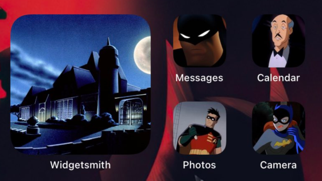
Even superheroes prefer app icons organised by colour
I was kinda bored ????????♂️#ios14homescreen pic.twitter.com/gFSgeeZV6Z
— رَايْـــــلِي (@Rayle_abogrean) September 21, 2020
I really appreciate @Rayle_abogrean’s iOS 14 layout, because he not only goes full Marvel with his treatment, but he’s theming individual pages based on the colour of the default iOS 14 icons. It’s a lovely way to show that customisation doesn’t have to involve spending hours recreating app icons. You can stick with what you have and still make a unique design work in a fun, fresh way.
Leave a Reply
You must be logged in to post a comment.