
Over the past three weeks, the /r/ProgrammerHumor subreddit has reinvented the on-screen volume controller hundreds of times over. Starting with one user’s sideways slider, users have created funny volume controls based on laptop screen angle, fidget spinners, battery power, latitude and longitude, and the digits of pi. I’ve gathered some highlights here. For maximum appreciation, imagine how each one sounds.
Photo by mienys
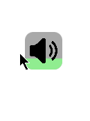
The first submission, by PM_ME_YOUR_WATERMELO, violates expectation so precisely that it belongs in a UX textbook:

The most popular submission, by user BMJ, is familiar to fans of Angry Birds, Worms or Mario Golf:

Photenth’s smoke-powered volume controller is practically a survival game:
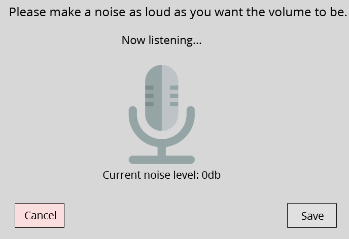
“Volume should be intuitive,” says kittens_from_space:
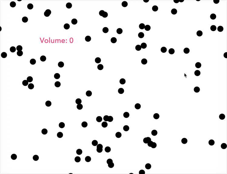
The most astounding technique is “a simple graphical volume control” by mienys:
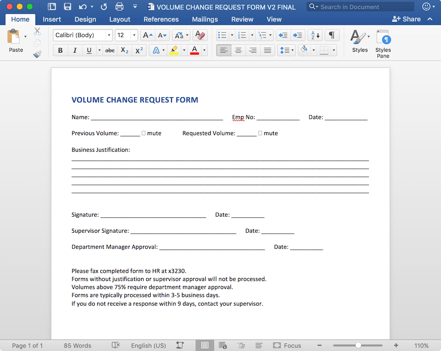
The volume change request form by boxidea is depressingly realistic:
Because jokes are funnier when someone explains them, I asked Jeffrey Zeldman, UX expert and author of Designing With Web Standards, what we can learn from Reddit’s fake volume controls. “It reminds us that design has the capacity to surprise and delight, even when it chooses not to do so,” he says. The most “boring” option is the one users immediately understand:
Design wants to be invisible when it’s in service to a user-controlled video or audio experience. These alternative controllers, even though they are presented as jokes, are sometimes innovative and often delightful. But, ultimately, their self-consciousness reinforces the idea that the best design in this case is largely invisible, and that convention beats innovation in this case.
The typical volume slider is different from the typical real-world volume control, which is usually a pair of buttons or a round knob. (Note the difference between your phone’s physical and on-screen volume controls.) The major precedent for sliders is in the professional world of mixing boards. Even those are relatively new, Zeldman says: “The Beatles and John Coltrane were mixed with round faders.”
But the best software interfaces don’t cling to physical methods. Onscreen, a volume knob “feels like a forced metaphor,” Zeldman says. “We like sliders because we think of volume and time as linear.” So while the volume slider doesn’t need to be reinvented, that’s only because it already was.
Comments
One response to “Reddit’s Terrible Volume Controls Teach Good Design”
Man the awkwardly tall horizontal volume control..and the volume control form are brilliant.
The microphone volume control is kind of a cool idea though.
Little things in design are what make it so great. Or awful.. I’ve never once thought of remaking the volume control.