If you’re planning to move to a new city, you might want to know how bad your commute will be. Traffic app Waze has put together a collection of infographics to help you find out.
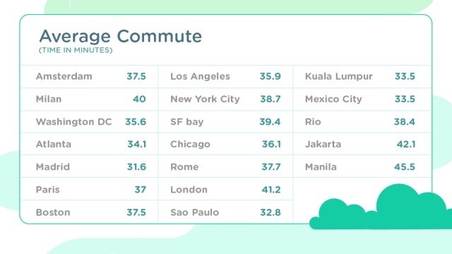
The charts look at traffic on a global scale, comparing various countries (unfortunately Australia doesn’t appear to be one of them). Later, Waze dives into the finer details, providing average commute time, and even ending with a score card for various cities. The score cards rate cities based on traffic, road quality, commute, and socio-economic status.
Global Driver Satisfaction Index [Waze via Talk Android]
Comments
One response to “Waze Graphics Show The Best And Worst Cities For Commuting”
No Straya that I can see 🙁