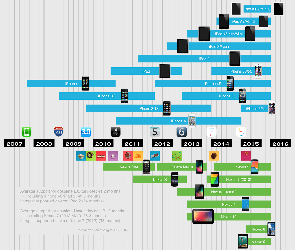
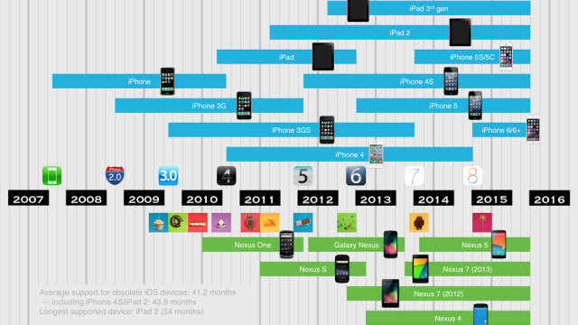
When you buy a new phone, you might reasonably want to know how long it’s going to get software updates. This chart helps you get an idea of what each platform is like by examining iOS vs. Nexus support lifetimes.
This chart from Android Police examines how long each iOS and Nexus device continues to receive updates. While the chart doesn’t examine the quality of those updates — on older devices, some updates may lack features or even make phone performance worse — it paints a pretty clear picture of how long you can expect a device to be supported.
On average, iOS devices have longer support times. Nexus devices haven’t done as well in the past, though the future may be less clear, as many of the longest-supported devices are still supported to this day, so we don’t know when they will be cut off. It’s worth keeping in mind, however, that Nexus devices are typically supported far longer than most Android devices. If nothing else, this is a pretty strong message that Android OEMs need to step up their game.
Software Updates: A Visual Comparison Of Support Lifetimes For iOS vs. Nexus Devices [Android Police]


Comments
2 responses to “This Chart Shows How Long iOS And Nexus Devices Get Updates”
Not sure if this is the best way to compare as Apple tend to push updates regardless of whether it is going to degrade the user experience of older hardware, in what can only be assumed as an effort to get people to upgrade to the latest phone. Android’s approach is different. Google tends to stick within the limits of a phone and don’t try to update an old piece of hardware with software it will struggle to run.
I think a problem with comparing the two like this is when Apple release an update on older systems they have historically artificially hamstrung older models. So you end up with a newer version in version number only.