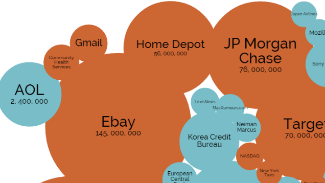
With the new year comes a fresh start, and there’s no better way to prepare for the new year than with a brief reminder of how important it is to be aware and careful with your data. This interactive chart covers the biggest breaches out there, along with reports of how it all went down.
Whether you’re doing some research or just interested in a reality check, this chart from Information is Beautiful has a lot to look at. The bigger the bubble, the bigger the breach, and if you click it, you’ll see a report of what happened. You can also sort by year, method of leak, and what kind of organisation was affected. There’s also a static version, if you don’t want to look at the chart with all the bells and whistles.
Remember, your data is never really safe online, and with the number of big companies hacked this past year, it seems data is never really safe anywhere. Stay aware and security-conscious.
The World’s Biggest Data Breaches [Information is Beautiful]
Comments