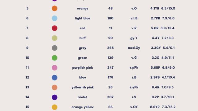
Colour-coded calendars are a great way to organise your life. However, after the first few colours, it can be hard to tell them all apart. This chart, which showcases Kenneth L. Kelly’s 22 colours of maximum contrast, provides a selection of colours that are easy to tell apart.
The chart comes from this post at Burgess Studio, listing Kelly’s 22 colours, in order of recommended usage. So, if you have five calendars, use the first five colours for maximum contrast between them. If you have 14, use the first 14, and so on.
This tip comes from Lifehacker reader, and while it applies to calendars, it’s really useful for anything that requires lots of distinct colours. If you have a certain number of colours you know you need, you can also use a tool like I Want Hue to generate a palette for you. Check out the full post below for more calendar organisation tips.
Comments
3 responses to “Use The ’22 Colours Of Maximum Contrast’ To Organise Your Calendars”
Thanks for this. Another good use of these would be for charts and graphs, particularly if you want to use something other than Microsoft’s default colour palettes.
I don’t know. I think I would need to spend a lot of time checking these colours on a chart or map to make sure I got things right
This is awesome for work, on larger projects we colour code tags on wires,.some of the colours we use now are hard to tell apart from each other.