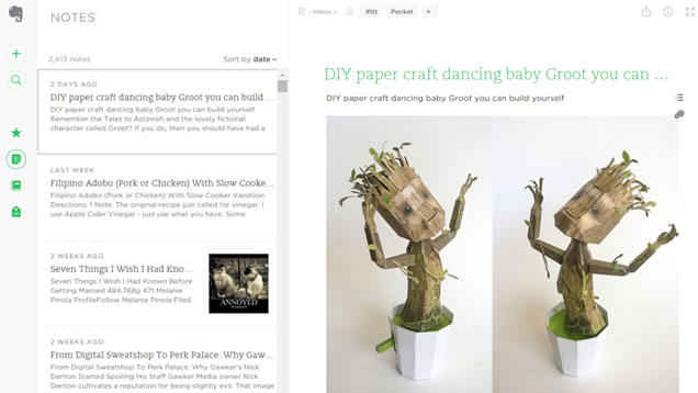
One of the biggests complaints about Evernote, at least for the web client, is its cluttered, clunky interface. That’s changed today with a redesign that puts your notes front and centre and hides the distracting parts of the interface.
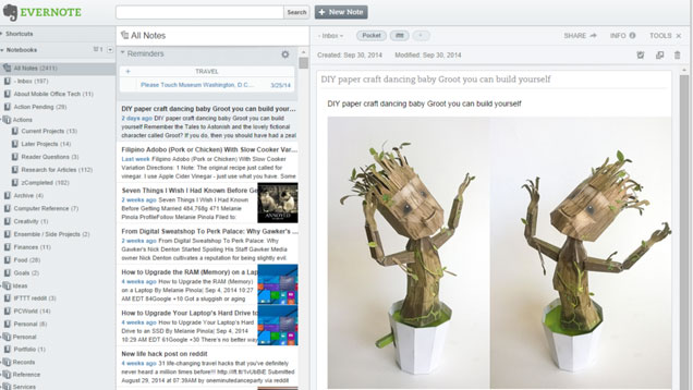
For comparison, this is what it looked like before (yes, I still have to clean up my notebooks, post-Springpad-import):
There’s a lot more white space in the new version and the simple icons on the left bring out menus that slide out to reveal your notebooks, tags and so on. The new interface makes Evernote even more ideal for writing projects, perhaps.
The new web version is currently in beta, and when you log in you’ll have the option to try it (you can reverse the decision in your account settings). The old UI will continue to live on, just in case there are those of you who prefer it.
Just head to Evernote.com to give it a go.
Evernote via TechCrunch
Comments