After a year of deliberation, Facebook finally settled on a new design for the news feed most of us see every day. Rather than adding more features and stuff most people don’t care about, they decided to go back to basics and simplify it all.
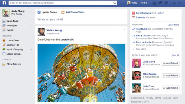
As pictured above, you can see they have removed the clutter currently plaguing the news feed. You now have fewer options directly at your fingertips, but less stuff cluttering up the page and making the options they think you care about harder to find. While this may upset some users, Facebook claims to have taken much care in how they have made these adjustments. They haven’t really moved much around to prevent confusion in the user experience. There will be less to click on, but the stuff that remains has kept its seat at the table.
For an in-depth look at the changes — which won’t be much for most users — check out the Verge’s timeline of Facebook news feed designs.
Facebook goes back to basics with latest News Feed redesign [The Verge]
Comments