statistics
-
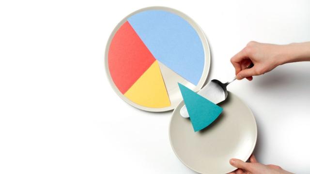
Here’s Why You Should Never Use a Pie Chart for Your Data

Here’s why you should (almost) never use a pie chart for your data

-
Why Your ‘Spotify Wrapped’ Recap Has Songs You’ve Never Listened To

It’s that time of year again. Spotify is here to tease you remind you about your musical habits over the past many months. Most people should have a pretty good idea of what albums and songs you’ve binged over the year—Hadestown, for me. For a friendly reminder, all you need to do is pull up…


-
Why Buying Your First Home Is So Hard In Australia
 34
34Housing affordability, high house prices and rents are attracting plenty of media attention right now. The latest figures on house prices, mortgages, number of first time buyers and so on are dissected by journalists and commentators as if this is an issue of recent origin. In fact what we have here is a long-term structural…

-
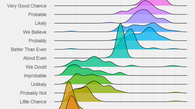
Here’s What Phrases Like ‘Highly Likely’ And ‘Probably Not’ Mean To Different People
Just how likely does “probably” sound to you? To some people, “probably” means that something is practically locked in. To others, it means the likelihood of something happening is highly dubious. This graph assigns percentage values to a range of common phrases relating to probability. Turns out you should say “almost certainly” instead of “probably”…