Since we tend to decide that it’s rude to talk about money with other people, it can be hard to figure out how to go from being broke to financially stable. This spreadsheet can help you explore the difference.
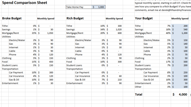
The sheet, from personal finance site Life and My Finances, lets you enter your monthly income, and then it automatically divides it into two budgets. The “broke” budget shows how that income might be divvied up in a typical budget that can leave you in a paycheck-to-paycheck lifestyle. The second one shows you a breakdown that allows for saving and reduces expenses.
A lot of what you’ll find reinforces what we’ve said before. However, seeing it in a fleshed out budget helps show where the sacrifices are made. The site also points out the benefit in buying older, paid-for cars rather than getting a car loan and putting that money towards savings. Once you’re done checking out the two given budgets, you can tweak the proportions in a third budget until you have one that’s balanced for you.
How Much Should You Spend On That? [Life and My Finances via Rockstar Finance]
Comments
3 responses to “This Chart Shows The Difference Between A Broke And A Rich Budget”
Looking at the examples at the top of the page, the “rich” budget seems to assume you’re paying less mortgage, spending about 40% less on clothes and 30% less on food. It also assumes you’ve already paid off a car, are somehow getting insurance at half the price and don’t have any student loans.
While I agree these are all savings techniques, it seems that it’s targeted at people living the champagne lifestyle on a beer budget.
For some reason, it reminds me of this tweet by dril.
https://pics.onsizzle.com/wint-follow-drill-food-200-data-150-rent-800-candles-5763241.png
They explain that: The “rich” person has bought a smaller house, a crappier car and doesn’t buy designer clothes. The assumption about why insurance is less is because they’re not insuring a McMansion and a brand new Jeep.
I agree with your point about the student loans, and can tell you in reality a “rich” person is likely to be paying FAR MORE insurance than someone living week-to-week, because they will be paying full-comp insurance on everything and likely have private health.
I wouldn’t “assume you’ve already paid off a car”, I would assume you _saved up_ and bought a car you could afford to pay for in full.
Personal Loans, Car Loans, Cable TV and Lottery tickets are great examples of things that “rich” people don’t spend money on.
@deathduck I don’t know why the mortgage is less, but spending less on clothes makes sense. I haven’t read the entire article, but it probably explains it’s better to buy a used car and not buy a new one on a loan (which means 0 car repayments and cheaper insurance), and only buying essential clothes.
Also, in Australia, student loans are taken from pre-tax income so shouldn’t show here. But I understand it’s from a US site.