Spreadsheets are a nerd’s data-driven dream. For most regular people, though, they’re a complicated mess. Fortunately, they don’t need to be. Here’s how to bend data to your will with Microsoft Excel 2016.
Get Up and Running With Excel Quickly
Excel is deceptively simple to get started with. The ribbon interface works exactly like the other Microsoft apps. Each tab along the top opens a new selection of menu options. If you can’t find a feature you’re looking for, explore the other tabs to find it. You can also click the green box that reads “Tell me what you want to do” to search for a menu option.
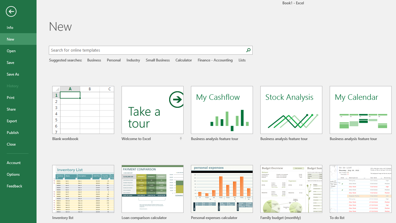
When you create a new document, you can also choose from a wide variety of templates. Excel 2016 can search thousands of online templates, including personal budgets, holiday itineraries, expense reports and inventory lists. You can search the template list for keywords or browse tag pages right within the app. You can also browse Excel templates online here.
This series assumes you understand the basics, but if you need a refresher, you can check out Microsoft’s official Quick Start guides here.
How to Do the Most Common, Essential Tasks in Microsoft Excel
Spreadsheets can be as simple as a basic table and as complex as an automated role-playing game character sheet. While everyone’s needs are different, there are a few basic tasks that you can combine to make the most robust spreadsheet you need. Here’s how to do some of the most essential tasks.
How to Apply Conditional Formatting
Formatting cells in a spreadsheet can turn a boring list of numbers into a useful document that’s easy to read. You can manually set text and background colours, text size, highlights and borders to help aid readability. The most useful feature by far, though, is the ability to style cells based on what’s in them.
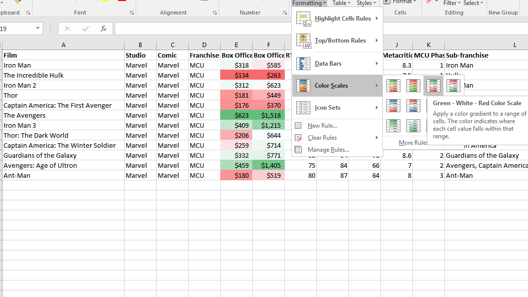
For example, in the screenshot above, I have a spreadsheet of comic book movies and how much money they have made at the domestic and worldwide box offices (yes, I really do have this, shut up). If I want to be able to see at a glance which movies have made the most and which have made the least, I can use conditional colour scales.
To apply a style, select the cells you want to apply the style to. In my case, I chose all the cells under a single column. Under the Home tab, you’ll find a button called Conditional Formatting. Click this and you’ll see a selection of styles you can apply. As you hover over each item in the menu, you’ll see a live preview so you can see how your data will appear once you make a selection. In the screenshot above, I used a style called the “Green – White – Red Colour Scale”. The highest numbers are coloured in green, while the lowest numbers are coloured in red.
If you decide you don’t like a style or want to change it, you’ll need to clear the old style first. To do that, follow these steps:
- Click the Home tab.
- Under the Editing section, click the Clear button.
- In the drop-down menu that appears, select Clear Formats.
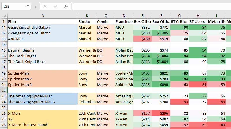
You can apply as many or as few styles as you want to a range of cells. You can also create your own styling rules if Excel doesn’t have the option you need built-in already. Keep in mind that a style will be applied to every cell you select, so how you choose your cells may affect how the style appears. For example, in the spreadsheet above, if I applied the style above to the domestic and global box office columns at the same time, all of the domestic values would be on the red end of the spectrum, making the style useless. In order to be useful, I needed to apply the style to each column individually.
Freeze Rows and Columns to Make Browsing Easier
The first row or column of your spreadsheet is often used for labels. In my sample spreadsheet, I want to be able to see which column I’m working out of no matter how very many superhero movies I have to scroll past. You can lock your labels in place by using the Freeze Panes feature.
Under the View tab, in the Window section, you’ll see button called Freeze Panes. If you click the drop-down menu here, you’ll find three options:
- Freeze Panes: This option will lock any rows above your cursor and any columns left of your cursor. So, for example, if you want to keep the first row and first column of your spreadsheet visible, place your cursor at cell B2 and click this button.
- Freeze Top Row: This option will freeze just the first top row in a spreadsheet.
- Freeze First Column: This option will freeze the left-most cell in a spreadsheet.
Once you’ve chosen any of these options, the first Freeze Panes option will change to Unfreeze Panes. You’ll need to unfreeze any panes before you choose new ones to lock into.
Use Formulas and Functions to Do Complex Maths
All those boxes of numbers aren’t going to be very helpful if you can’t do anything with them. The formulas and functions in Excel help you do a ton of complex calculations so you can draw meaningful conclusions from your data.
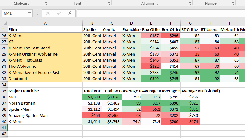
Formulas are the most basic way to do maths in Excel. All formulas begin with an = sign. You can then create basic problems using cell labels. For example, in the screenshot above, say I want to see how much the two standalone Wolverine films have made overall in the entire world. I would use the following formula:
=F29+F31
This would add the two numbers together — $373 + $414 — to give me a grand global total of $787 million (each cell value represents millions).
Excel also has a ton of pre-made functions to do more complex maths for you. For example, say you want to find out how much money the X-Men films have made globally on average in the above spreadsheet. For this, you can use the AVERAGE function. To take the average of all these films, you’d use the following line:
=AVERAGE(F26:F33)
The colon in this line indicates that the AVERAGE function should include the entire range of cells between the first and last cell. So, this function will take the average of every value for an X-Men film in column F.
You can also nest functions within each other. For example, say I want to find out the average user Rotten Tomatoes rating for each X-Men film. The average rating of all the cells in H26 through H33 in the screenshot above ends with three decimal places. Instead, I want to round that number down to a single decimal place. According to Excel’s documentation, the ROUND function should be formatted like this:
=ROUND(number, num_digits)
Here, “number” indicates the number I want to round, and “num_digits” represents the number of digits I want to round the number to. In this case, the number I want to round is the result of the AVERAGE function. So, in order to chop those extra decimal points off the average, I’ll use the following function:
=ROUND((AVERAGE(H26:H33)),1)
This is what’s called a nested function. First, Excel calculates the average of the cells in H26 through H33 (seen in bold above). Then, it uses that average as the number argument in the ROUND function. The 1 at the end of the line indicates that the number should be rounded to one decimal point. So, instead of getting an average rating of 78.875, which is the actual average rating, you see 78.9 in the final sheet.
As you can see, formulas and functions can range from very simple to incredibly complex. These examples just barely scratch the surface of what you can do with formulas and functions. You can check out this guide from the How-To Geek for a deeper dive into what you can do with functions. You can also browse the functions built into Excel and learn how to use them here.
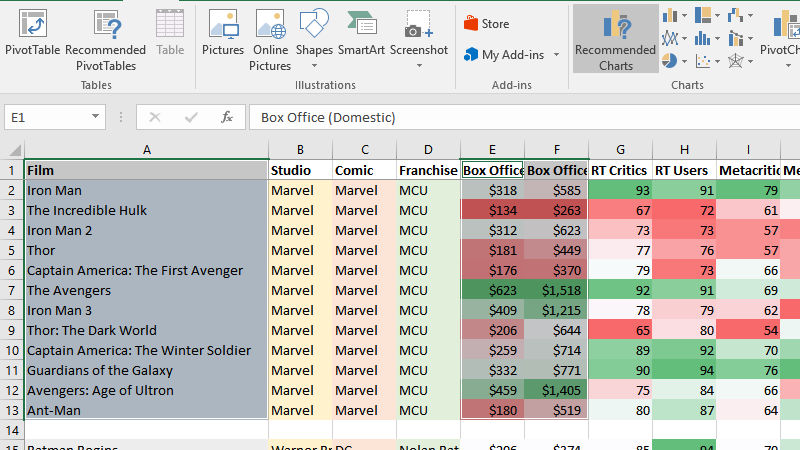
Use Pivot Tables to Draw Meaningful Conclusions
In the above example, I used functions to manually create a table with information about my spreadsheet. Pivot tables offer an easier way to do this without having to carefully craft complex formulas to do basic tasks like rounding an average. When you’re dealing with large data sets, this can be invaluable.
You can create a pivot table in one of two ways. On the Insert tab, you can click Recommended PivotTables and Excel will suggest tables based on the data you already have entered in your spreadsheet. Alternatively, you can click PivotTable to manually create your own. Both will open the pivot table interface on a new sheet.
In a pivot table you can choose specific subsets of your data to analyse. For example, say I want to see the average Metacritic review scores. On the right side of the screen, I’ll select the Film, Metacritic and Metacritic Users fields. This will give me the following table:
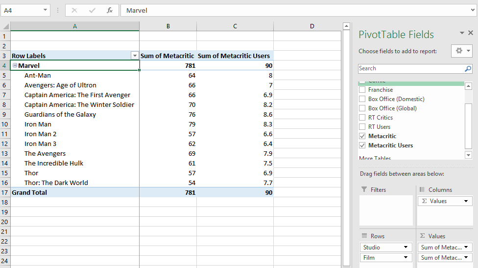
By default, the table will show me the sum of each line. While that would be handy for something like total box office gross, in this case the sum of review scores is useless. I’ll need to tweak it. To do that, I’ll click the dropdown arrow next to “Sum of Metacritic” in the Values box. Then, I’ll click Value Field Settings. This will give me new options for which data to display.
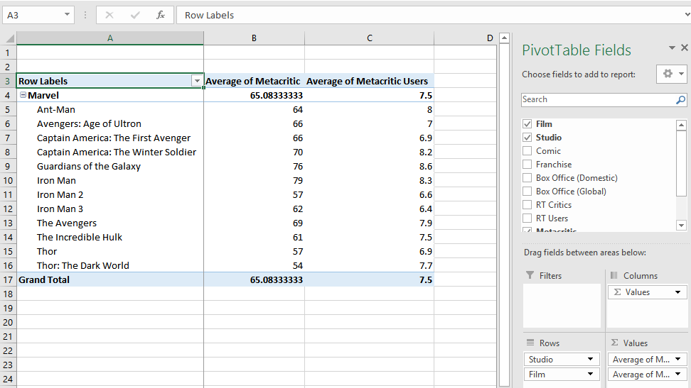
In the Summarize Values By tab, I’ll choose Average, since that’s a more meaningful calculation. Next, I’ll do the same thing for the Sum of Metacritic Users field in the Values box. This will give me a much more useful table:
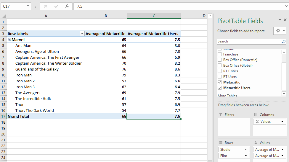
Just like in the last section, that trailing decimal in the Metacritic column is bothering me. Fortunately, I don’t need to deal with nested functions this time. To fix this, I’ll open up the Value Field Settings menu again. This time, I’ll click the button at the bottom of the window that says Number Format.
In the list of categories on the left-hand side of the new window that appears, I’ll select Number. Here, I can choose how many decimal places I want to include. For the Metacritic column, I’ll choose zero, so it’s consistent with the original scoring metric. I’ll make the same change for the Metacritic Users column, but this time I’ll choose one decimal point, since Metacritic users rate on a one decimal point scale. My new table is much cleaner:
My new pivot table is much easier to read. You can use pivot tables to examine your data in a variety of ways without changing the sheet your data is stored on. For example, I can quickly add columns for Box Office data or Rotten Tomatoes ratings. I could also drag the Film field from the Rows box to the Filters box so that my table only displays the totals for each column, instead of the individual lines themselves.
When you’re dealing with huge data sets, pivot tables become essential. Sometimes they can be a bit difficult if your data isn’t formatted quite right (the blank rows I leave between different franchises regularly throws off automatic pivot tables, for example), but they’re often much quicker and more flexible than building your own tables from formulas.
Insert Page Breaks to Make Printing Spreadsheets Easy
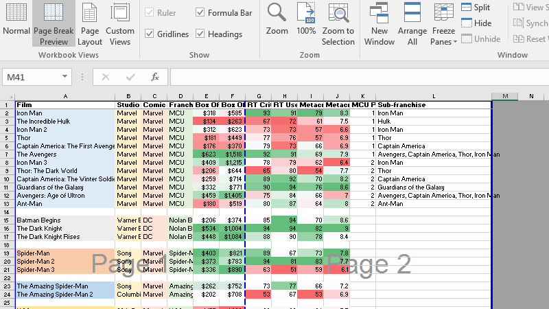
Unlike Word documents, spreadsheets aren’t designed with regular, easy-to-print pages in mind. To compensate for this, use the Page Break Preview feature. With it, you can change how your sheet is divided and what data should print on which page.
To open this view, click the View tab. In the Workbook View section, click Page Break Preview. Your spreadsheet will zoom out and show you which sections will print on each page. You can drag each line to resize the sections as you see fit.
If you want to add more page breaks, follow these steps:
- Place your cursor on the row or column where you want to create a new page break.
- Click the Page Layout tab on the ribbon interface.
- Click the Breaks button.
- In the dropdown that pops up, click Insert Page Break.
In the case of very long documents, Excel may introduce automatic page breaks when you reach the maximum amount of space that can fit on a page. You can’t remove these page breaks, but any of the others including the page breaks you add can be moved or removed at will. To get back to the normal view, return to the View tab in the ribbon. Under Workbook Views, click Normal.
Create Charts to Visualise Your Data
To get a better idea of what your data looks like, you can create custom charts based on all or part of the data in your spreadsheet. Excel comes with a ton of ready-made styles you can choose from, or you can customise your charts to suit your needs.
To create a chart, first select the cells you want to include. In some cases, you may need to format your cells a certain way for Excel to understand them, but you can read about how to format your cells for each type of chart here. In this example, we’ll use the movie data for the Marvel Cinematic Universe in the screenshot above. I’ll select everything in columns A, E and F.
Once you’ve selected your data, click the Insert tab in the ribbon. In the Charts section, you’ll see a button called Recommended Charts. This will automatically choose the type of chart that Excel thinks is best based on the data you’ve selected. In my case, I chose “clustered columns” from my suggestions.
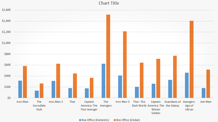
Once you’ve created your chart, you can customise it how you need. In my case, there are a few things I don’t like about this one. I want to change the chart title so it’s more descriptive. I want to add a label to the left axis to indicate that the numbers are measured in millions. Also, it would be nice if the colour scheme was a little bit less boring.
The first problem is easy. You can click the title of a chart to change it. To change the axis labels, you’ll need to add one first. Click somewhere in the empty space on the chart to select the chart itself. Three buttons will appear next to the top right corner of the chart. Click the first button with a green plus icon. Here, you can add elements like an axis title. You can then click the label to edit it the same way you edited the title.
To change the style of the chart, select it and click the box with a paintbrush symbol on it. Here, you can choose from a selection of preset styles. You can also change the colour scheme of your chart by clicking Colour at the top of the style-picker box. Now, doesn’t this chart look so much nicer?
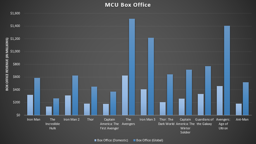
By default, any new charts you create will appear on the sheet you have open. If you’d rather keep your charts separate, you can move them to their own sheet. To do so, right-click the chart and select Move Chart. In the box that appears, select “New sheet” and give it a name. Click OK and the chart will be moved to its own sheet.
The Best New Features of Excel 2016
The basics of spreadsheets are as fundamental as maths itself. Even so, Microsoft has managed to add new useful features in Excel 2016. Here are some of the best tools in the most recent version:
- You can search the ribbon: Just like the other new Microsoft Office apps, you can search the ribbon if you can’t find the feature you’re looking for. Click the green box at the top of the screen that says “Tell me what you want to do.” Enter keywords or describe what you want to do and Excel will suggest features for you.
- Collaborate with others in real-time: Another feature common to all Office apps, you can share your documents to your OneDrive account and work with other users on the same document at the same time. Much like Google Docs, everyone can see each other’s changes as they happen.
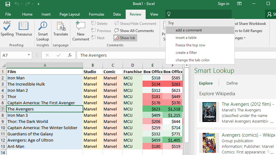
- Research in the app with Smart Lookup: If you need to find some quick information on a cell in your document, you can use the Smart Lookup tool to find it without having to leave the app. You can get links to Wikipedia, definitions of words, and get Bing image search results all inside Excel.
- Draw your formulas with Ink Equations: Some maths equations are easier to write than they are to type. In Excel 2016, you can draw maths equations to add them into your spreadsheet. This is particularly handy if you have a stylus or touchscreen on your computer.
There’s a lot more buried old and new features buried underneath the surface. You can check out more about the newest versions on Microsoft’s website.
Work Faster in Excel With These Keyboard Shortcuts
You can find a complete list of keyboard shortcuts for nearly everything in Excel on Microsoft’s website here. Here are some of the most common ones that you’ll use every day:
- Ctrl+N/Ctrl+O/Ctrl+S: Create, Open and Save a document
- Ctrl+X/Ctrl+C/Ctrl+V: Cut, Copy, Paste
- Ctrl+B/Ctrl+I: Bold, Italic
- Ctrl+Page Up/Page Down: Next/previous sheet
- Ctrl+F1: Expand or collapse the ribbon
- Alt+H: Go to the Home tab on the ribbon
- Ctrl+Arrows: Move to edge of section
- Shift+Space: Select entire row
- Ctrl+Space: Select entire column
- Ctrl+;: Enter current date
- Ctrl+Alt+;: Enter current time
Excel also supports many of the same text navigation shortcuts that we’ve covered previously here. You can also navigate the ribbon by pressing Alt. The app will then show you what button you can press to change tabs or access the functions currently available.
Additional Reading for Power Users
There’s virtually no limit to the ways you can use Excel to make your own spreadsheets. You can create anything from a simple to-do list to sheets that damn near seem like applications of their own. Here’s some more reading to help you on your way:
- Four skills that will turn you into a spreadsheet ninja: Mastering spreadsheets is an art. Our guide here will teach you about input forms, statistical calculations, pivot tables and macros.
- Learn how to master VLOOKUP to find data easily: One of the most useful functions in Excel is called VLOOKUP. This allows you to lookup one piece of data in your spreadsheet based on another piece of data you already know. For example, if you have a document that lists the name, price and SKU of a product, you can create a formula that finds the price when you enter a name or a SKU.
- Download free Excel templates to manage time, money or productivity: There’s no need to reinvent the wheel. Not only does Excel have a huge repository of spreadsheet templates built-in, but you can find plenty more online to suit your needs. Find one you like before you try to build your own from scratch.
- Excel Formulas: Why do you need formulas and functions?: This collection of guides from the How-To Geek covers intermediate to advanced lessons on how to use Excel functions and create formulas of your own.
Spreadsheets aren’t nearly as boring as the movies have led you to believe. While it can take a little work to get started, you can turn tediously collected data into visually impressive and informative charts.
Comments