Everyone thinks they understand good design. While we all understand our tastes, there’s more to making a well-designed product than just making it pretty. Form and function have to combine to work well together, but they both need to be present. Here’s why form matters, when it makes a product better and when too much can actually make a product worse.
Picture: Tina Mailhot-Roberge
Why Good Design Matters (and You Shouldn’t Be Afraid to Spend Money on It)
It shouldn’t be controversial to assert that good design matters when it comes to the things we buy. Function is important too of course, but good form can compliment function, or make function accessible in a way it wouldn’t be otherwise. Attention to design is what made web browsers, voice commands in iOS and Android instead of hardware buttons, and predictive smartphone keyboards actually useful instead of crappy. Without it we’d still be drowning in nested menus and layered toolbars, which many applications still cling to.
In the same vein, there’s a pervasive belief that form doesn’t matter as much as function. We hear it when people rail against companies like Apple and Google, and especially if they feel that design makes technology more expensive. “Why should I pay so much more if it’s just pretty and well designed when I can get a computer with the same guts for less?” Well, it’s about more than guts. Good design is more than just cosmetics, and while cosmetics are important, they’re not the end of the story. No one wants to pay unnecessarily for looks, but you should also remember that your technology investments are just that. They have value to you over time, and while that value doesn’t increase, you still want to maximise it. Besides, if form didn’t matter at all, human interface engineers and UI/UX designers wouldn’t have work, would they?
When Design Makes Products Better
It’s important to consider design features while you’re shopping for a laptop. You would probably consider the same things when buying a smartphone or a pair of headphones. In addition to asking “how good is this at its intended function,” you also consider “is this well built” and “will I easily break this?”
Here are a few scenarios where good design really matters, and when you should pay attention to it:
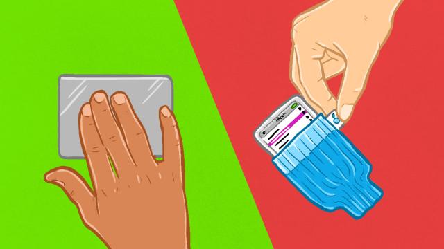
- Build Quality: When it comes to laptops, smartphones, headphones, electronics and other gadgets, this is where design really matters. Is this thing built to last, or will it fall apart? Does it feel flimsy, or is it sturdy when you use it the way you’ll use it when you take it home? Is the item made from quality materials? For example, Apple gets a lot of heat for over-designing its products, but its laptops are made from solid aluminium, with special attention paid to the way ports are carved out of the body. Apple’s trackpads are glass, but feel like metal, and are built to stand up to regular use. That level of attention indicates hardware that will likely last longer than you’ll actually want to use what’s under the hood.
- Durability: Durability is a bit like build quality, but in this case refers more to whether the tool will stand up to regular use without breaking down or slowing down. For example, a good, sturdy pair of headphones that sound great may still show signs of cracking where the headband meets the earcups if you have a wide head, depending on how you personally use them. Think about your use case when you buy and whether or not the device you’re considering can stand up to the type of punishment you’ll put it through. A well tailored pair of jeans may be made from quality denim and perfectly sized, but if you need work pants, for example and they’re not rugged enough to stand water, rain and wind, they’re not durable and not worth your investment.
- Accessibility: Accessibility is important in physical devices (think about how easy or hard it is to reach the power button or volume control one-handed on your phone), but it’s especially important in software. When we tweaked Windows for high-resolution screens, we spent time in the accessibility options. Does this app have features that make it easy for you to read at night? Does it support voice commands? If you’re visually impaired, can it increase the text size or speak text aloud? For example, Microsoft’s decision to add the “ribbon” to Office 2007 was hotly debated, but largely considered good for accessibility. It put commonly used features front, centre and easier to access without diving into menus or requiring lots of nested toolbars. The idea of floating common tools in front of the user while hiding less-often used ones stuck and is with us in lots of apps today, including Windows Explorer.
- Personalisation: Personalisation may not be important to everyone, but most of us like being able to customise the tools we work with. That includes bringing features we like to the front of an app or being able to choose the type of switches in our mechanical keyboard. Personalisation is more than colour; it can often mean the difference between making do with whatever a manufacturer chooses for you versus making a product perfect for you when you open it. Mechanical keyboards are an excellent example of this. For some, a cheap keyboard is enough, but for enthusiasts, the option to choose your switch type and keycaps to suit your typing style and preferred feel is something they could never live without. None of that necessarily changes the actual physical purpose of a keyboard, but it certainly changes how you interact with and feel about using one.
- Aesthetics: Most people care a lot about the look and feel of the things they buy, even if those things aren’t integral to how it works. It’s highly personal, but it’s still important to consider before you spend money. Whether it’s an HDTV or a smartphone, consider whether the item is designed in a way that you find attractive or pleasing to the eye. This is the reason people argue over whether iOS or Android “looks” better, or whether Apple laptops are more attractive than similarly well-designed ultrabooks. Keep in mind though that products that “look” better hold their value longer. After all, people like to buy attractive things. There’s no right answer for everyone, but there’s definitely a right answer for you and you should seek it out. Just focus on your personal sense of aesthetics and not necessarily what marketing tells you.
It’s easy to get caught up in the mindset that only features matter, but focusing entirely on whether a product “ticks all the boxes” will lead you right into /”Checkbox Syndrome”. That’s what happens when we spend money on things we don’t need because we think we’re supposed to buy the thing with the longest spec sheet. We assume more features means we’re getting a better product and nothing could be further from the truth.
Instead, focus on your needs and what you want to get out of a purchase and then examine the features that meet those needs. Are they well implemented, easy for you to use, or well built? Which device do you think will make you happier in the long run? Do you actually enjoy looking at or using this product? Ask yourself those questions instead of looking around for the phone with the most widgets you’ll never enable, or the software with the most options you’ll never use.
When Too Much or Strict Design Makes Products Worse Instead
Of course, there are other situations design can actually make a product worse. A good example here are Apple’s laptop and device charging cables. People have had to come up withseveral ways to coil those cables just to avoid breakage. Apple’s persistence on keeping a consistent style and look to its cables ultimately means they sacrificed build quality in the process. Apple’s now-infamous “hockey puck” mouse is another great example where a desired look beat out common sense (and, as a result, the mouse is a common entry on “worst Apple products of all time” lists.) In each case design won, but the rest of us lost.
Apple’s not the only offender here. Samsung only recently learned that no one wanted TouchWiz and has slowly rolled it back. Back in 2010, music site TheSixtyOne completely overhauled its design with a photo-centric method of browsing music. Unfortunately, while some pundits loved it (check the comments on that article), it led to a mass exodus of users and open revolt by the user community. Even so, the founders stuck to their guns and while the site still exists, it’s abandoned, more or less another music service graveyard. Users left for services that directed their energies towards improving the experience instead of simplifying for simplification’s sake.
Of course, no one likes change and every design change or iteration will be the last straw for someone, but all of these are examples of services where design came at the expense of usability and functionality. The two need to complement each other and it’s important to look past all the people screaming “look how pretty!” to see the real purpose behind the design.
Comments