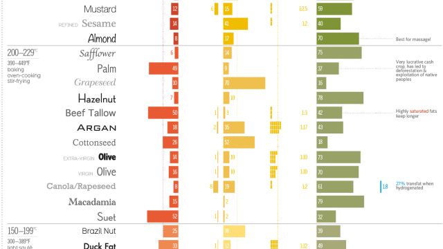
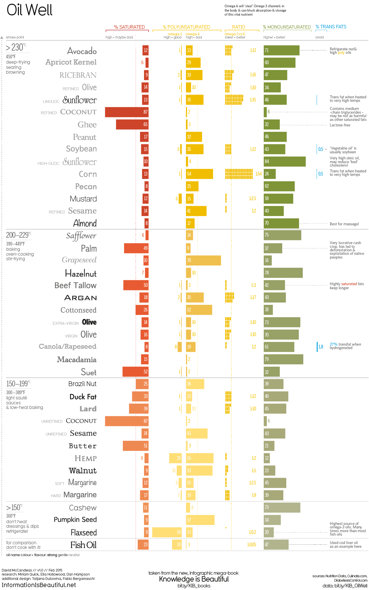
It makes sense to have more than one oil for cooking in your kitchen, but which ones are best for you? This infographic from Information Is Beautiful grades oils by their fat content, smoke point and flavour.
The oils are grouped by smoke point and the chart suggests uses for each group. It also shows each oil’s percentage of saturated, polyunsaturated, and monounsaturated fats — as well as trans fats when the oil is heated too high. Even though saturated fat isn’t necessarily the devil we were taught it was, you might prefer to choose oils that have bigger green bars (monounsaturated fats) and a good ratio of Omega-3 compared to Omega-6 fats.
The graphic points out other considerations and notes, such as the more bold the colour of the oil name, the stronger the flavour. You can see all the source data for this infographic in this Google spreadsheet.
Oil Well [Information Is Beautiful via Fast Company]
Comments
4 responses to “This Chart Shows Which Cooking Oils To Use Based On Health Properties”
So Sunflower for deep-frying. Olive or Canola for other cooking. Cashew for salads.
For reference (since it isn’t in the table)
Rice Bran Oil
Smoke Point : 232C
Saturated Fat : 25%
Polyunsaturated : 37%
(Omega 3 : 2.2%)
(Omega 6 : 34.4%)
(Ratio 1:16)
Monounsaturated : 38%
Trans Fats : 0%
Is Ricebran not third from the top?
Aeongrave – yes, and I’m a moron 😛
Oil is a highly processed food that comes from a whole food, kind of like sugar comes from a sugar cane plant. (just a note, did you know you need about 3 feet of sugar cane to make a tbs of sugar? It takes 1375 olives to make a litre of oil!)
Back to oil, it is pure fat, and many of the great nutrients and properties of the whole food are extracted in the process of making a whole food an oil.